Founded in 2013, WebLeilões is a company specializing in conducting Judicial and Extrajudicial Auctions throughout Brazil.
They believe in simplifying processes, aiming to reduce bureaucracy and leverage technology to optimize the auction market, making the experience more practical and advantageous for all parties involved.
Concept – In this logo, I bring the abstract and representative shape of the word “web” as a key element. We showcase not only the personality and dynamism of the brand but also the digital inclusion of its services.

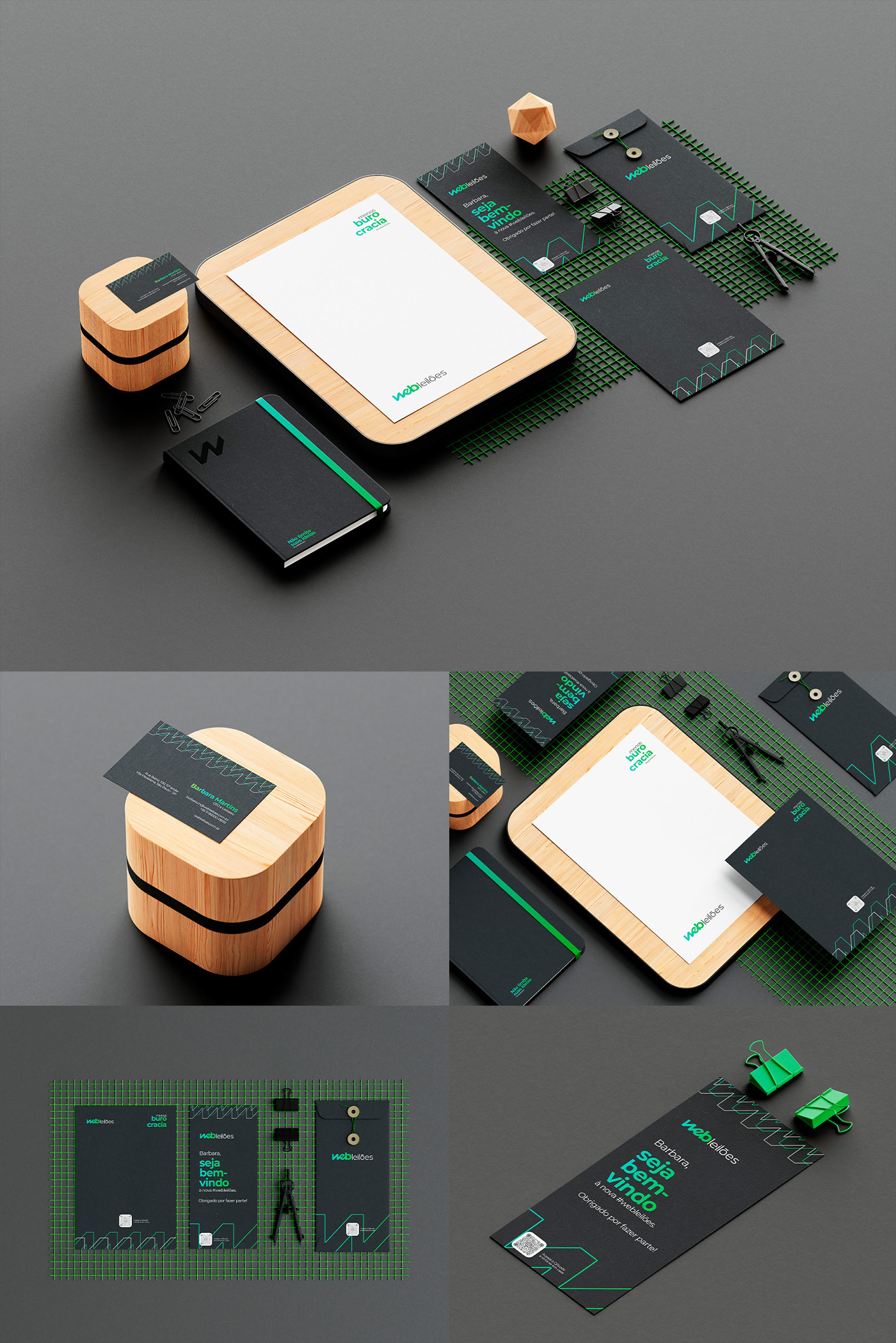
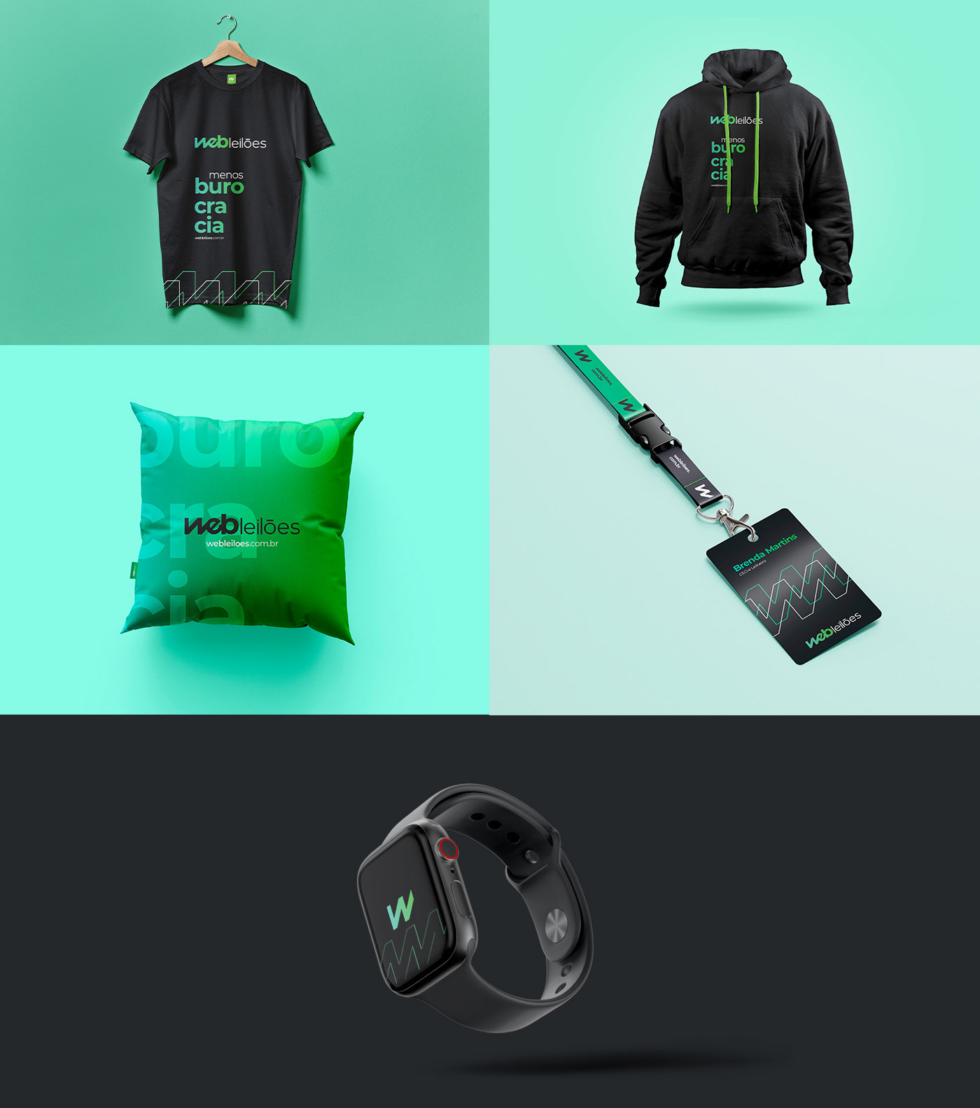
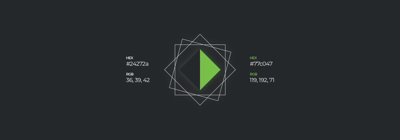
Color – The colors were chosen based on sensations that we want to convey to the user, with black conveying nobility, tradition, curiosity, superiority, power, professionalism, and sophistication; and green representing the color of life and rebirth. Green is intrinsically associated with growth and abundance, as well as reducing stress and bringing tranquillity to those who observe it.
Gradient – The gradient used in the green color aims to add an extra touch to the design, brightening up the logo. It represents the shades that nature brings to us, conveying them in a delicate way to our target audience and highlighting the brand.

Logo – From this concept we will be able to have the main brand horizontally and the icon to be applied separately as a Favicon or any other need.
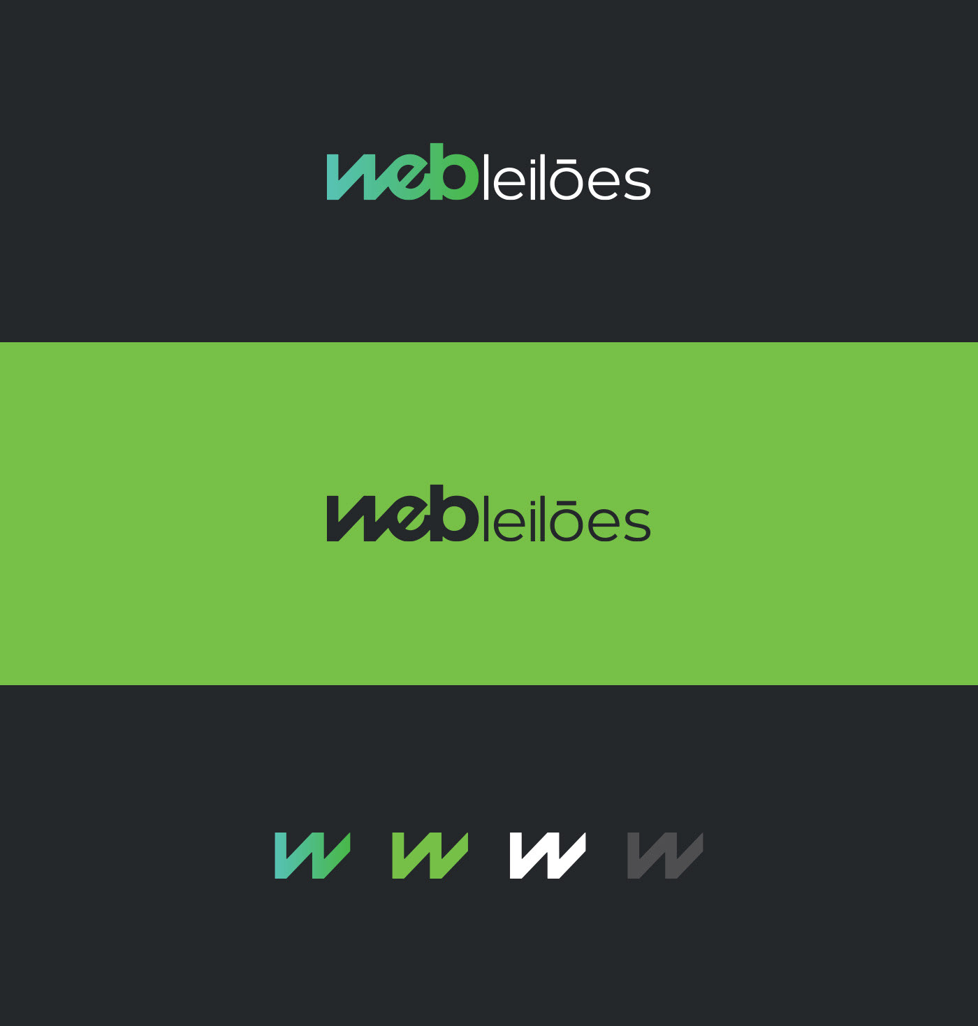
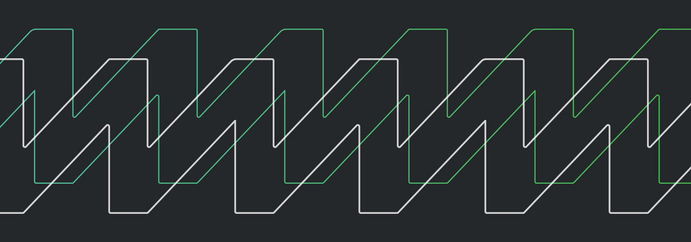
Pattern – Patterns play a significant role in brand recognition. Our brains are inclined to identify and recognize patterns more swiftly. We rely on repetition as a way to remember things, which is why patterns hold such importance in branding. They make brands memorable and form the foundation of visual identity.