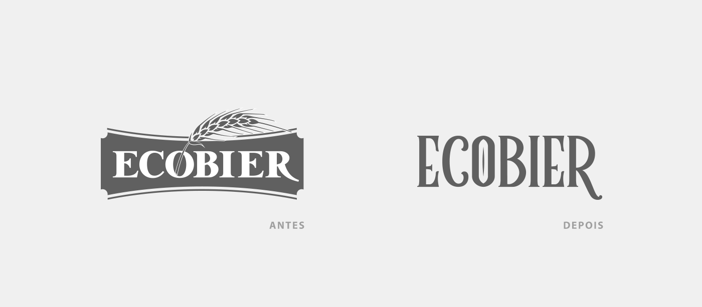
The objective of this study is to present a modernization proposal for the logo and label of Ecobier Puro Malte. We start with the company's logo. In order for a brand to be more easily remembered by consumers, it needs to have simplicity. Therefore, the barley branch was removed from the logo, as it doesn't bring a unique differentiation to the brand. Emphasis was placed on the company name, with unique typography.
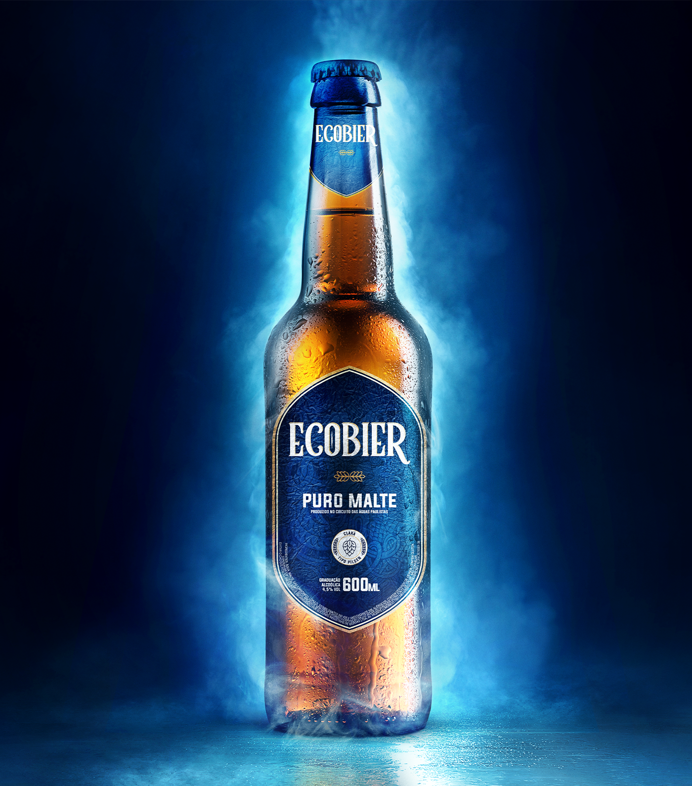
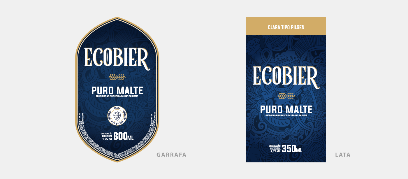
The label of Ecobier Puro Malte has gained a special shield-shaped design, making it easily distinguishable from competing products and presenting itself as an exclusive product. The can have been redesigned and is now “fully labelled,” creating even greater distinction at the point of sale.
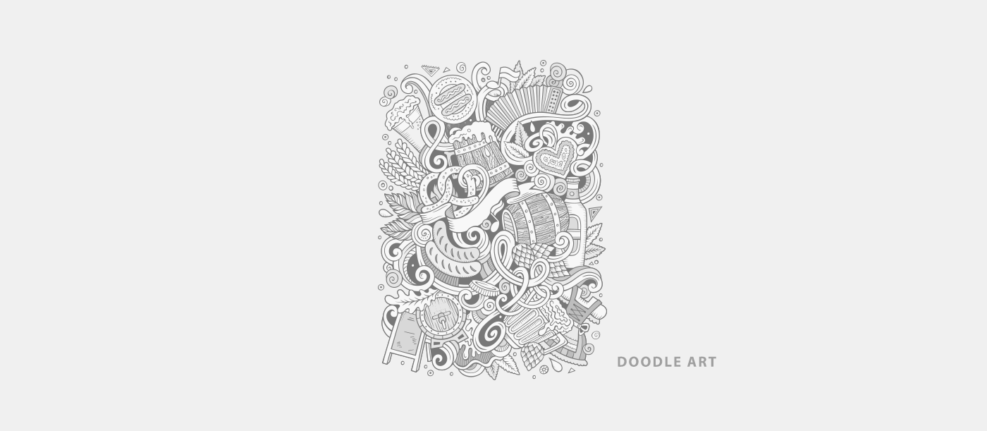
With modern visual elements and the use of hand-drawn lines, the label's background now features “doodle” illustrations that evoke the special moments when beer is commonly enjoyed, such as barbecues, celebrations, parties, etc.
Assets
Setting and final composition

Assets
Setting and final composition