Extramax's main mission is to provide quality services in distribution, execution, and logistics. To achieve this, it is essential, first, and foremost, to instill confidence in its customer base. This is the foundation of our logo proposal – a strong, solid brand that conveys the company's values in a more modern and bold way.

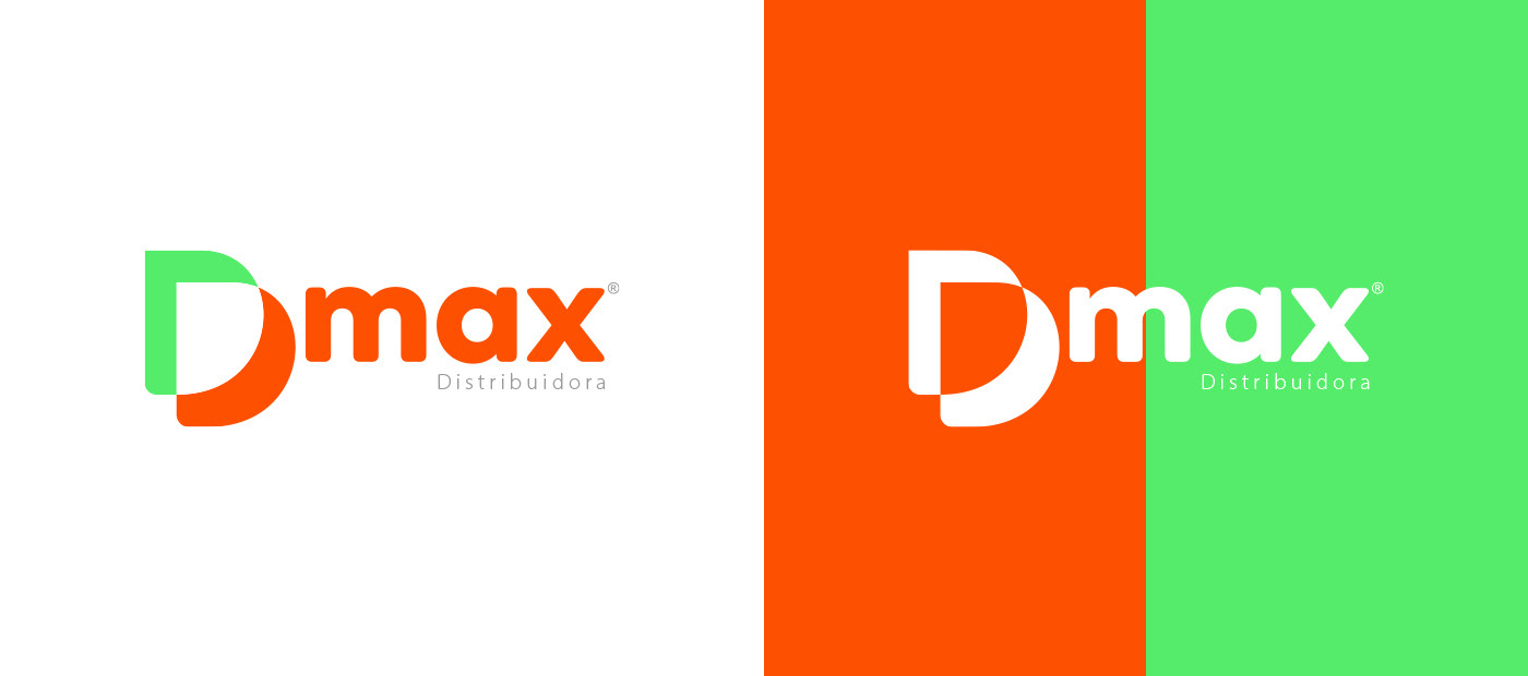
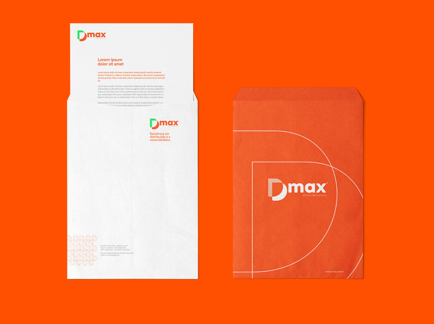
The client's goal was to rebrand the logo and the entire visual identity, so we modernized and brought a new concept for a new name: Dmax - Distribuidora
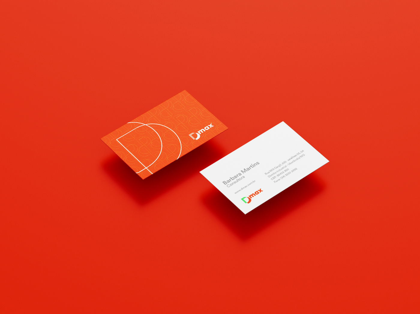
Symbolism – A brand consists of verbal and visual guidelines responsible for translating concepts and values into texts and images. Therefore, they make up the rules for implementing the new brand, with the concern of creating an integrated and consistent system of visual and verbal identity.

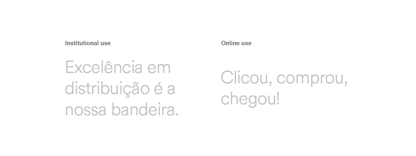
Slogan – The slogan is a phrase (or two) that highlights the company's activity, emphasizes a value or a feature, or helps clarify the mission of your brand. They can be an essential part of your brand identity; think of Nike's “Just Do It.”
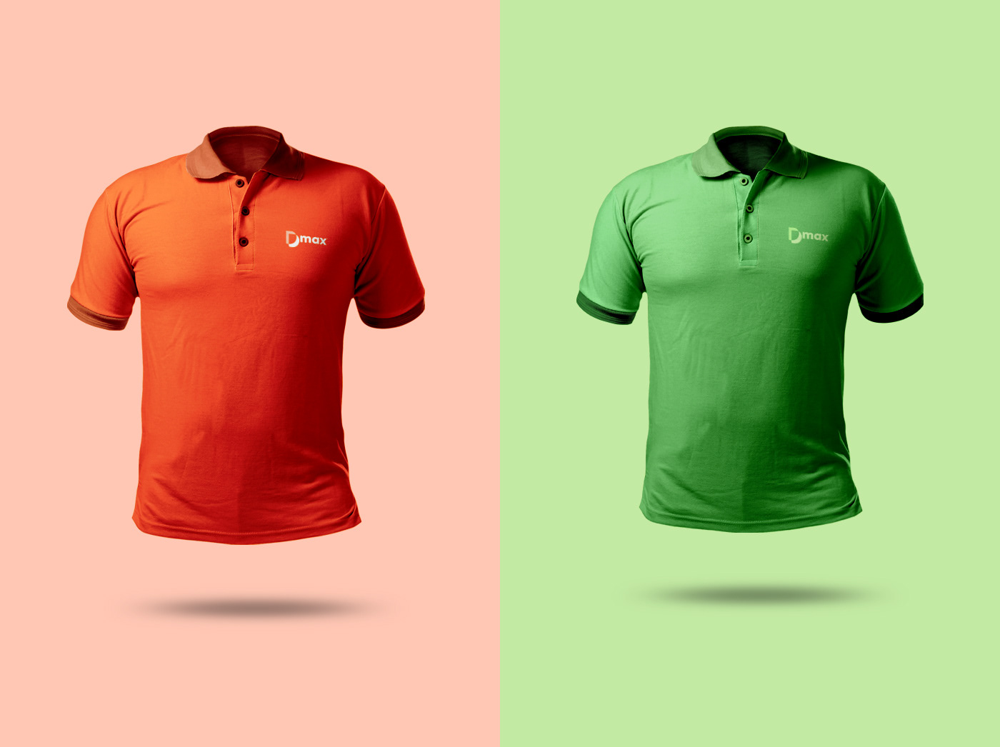
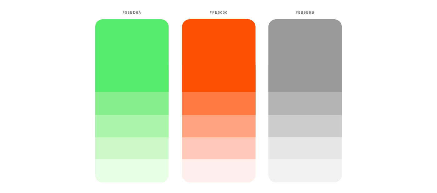
Color palette – A study called “Impact of Color on Marketing” indicates that 93% of people evaluate the colors of a product at the time of purchase, and 84% of consumers believe that the color of a product is much more important than other factors.
We have utilized a color palette that is not significantly different from the original, but it stands out from the competition in the market. The light blue evokes a sense of cleanliness and freshness, while also stimulating productivity and conveying a feeling of success. On the other hand, the dark blue exudes a corporate vibe, showcasing power and confidence. It's a spirited color that provides calmness and reassurance to people.
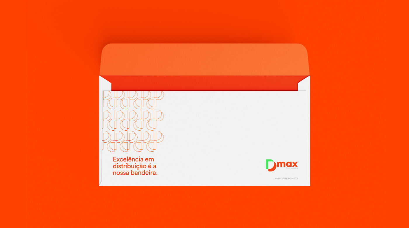
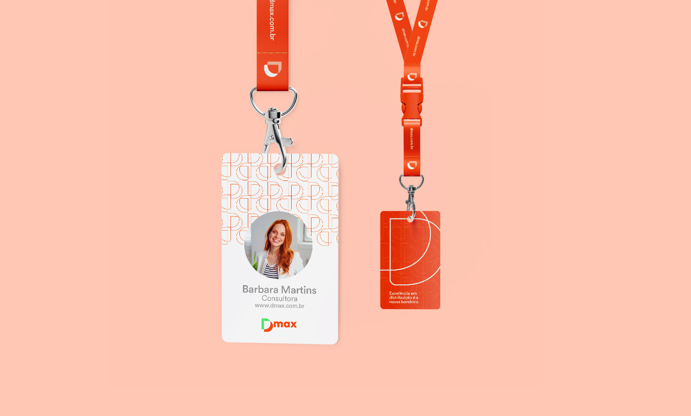
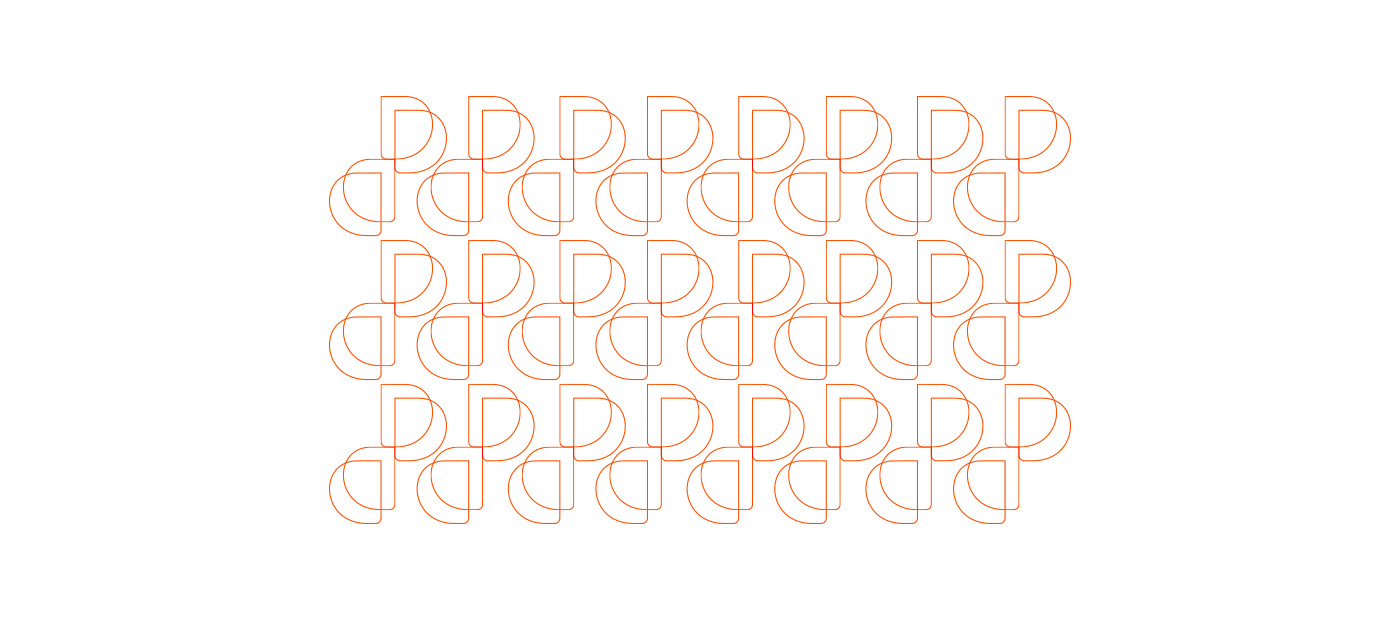
Pattern – Patterns play a significant role in brand recognition. Our brains are inclined to identify and recognize patterns more swiftly. We rely on repetition as a way to remember things, which is why patterns hold such importance in branding. They make brands memorable and form the foundation of visual identity.
A beautiful example of this is the Louis Vuitton brand. You recognize the bag. Its brown leather with a printed four-leaf clover and the LV monogram is immediately identified as the international symbol of luxury. The patterns are embedded in the brand's branding strategies, mainly because they are integrated into the product, creating loyalty and closeness between the customer and the brand.
The Louis Vuitton brand is one of the most valuable brands in the fashion market, but would it have the same strength without its famous and iconic pattern that is still used today? Probably not.
Solution – With a contemporary and disruptive proposition, we needed to create a brand that would translate all these concepts equally and directly. In this scenario, Dmax emerges.
While the geometric lines bring the solidity of the distribution segment, the fluidity and the use of a hollow graphic system demonstrate the modernity and transparency of the brand.
Adding to the stylized letter “D,” we incorporated the word “max” with a Geometric Sans Serif typography and a vibrant color scheme, which was rarely used in the segment until then. With this rebranding, the brand carries with it all the years of dedication and experience to meet the demands of an increasingly demanding and digital presence.