The COIB is part of the Dentista do Povo Group. There are over forty units spread across four states in Brazil. These clinics make our patients' dreams of smiling again come true every day. As a result, we have formed the most satisfied customer base in the country, with over 100,000 patients being served every month.
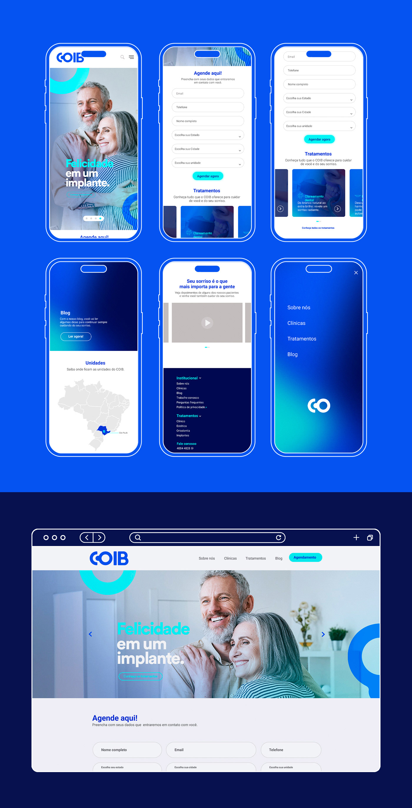
The client's objective was to rebrand the logo and the entire visual identity, so we modernized and brought more concepts to the brand to make it stand out among the major players in the Brazilian dental market.
Market Analysis – Before we began the logo creation process, we conducted a competitive analysis and identified several visual elements that caused us discomfort. This included thin typographies that could hinder readability, logos with excessive details or outdated design choices unsuitable for the industry. Additionally, we noticed a lack of overall harmony in the visual composition of each logo. The absence of organization starts from the outer layers, and visual elements serve as the business's calling card.
Concept – A brand comprises verbal and visual guidelines, responsible for translating concepts and values into texts and images. They constitute the rules for implementing the new brand, with the aim of creating an integrated and cohesive system of visual and verbal identity.
Slogan – For the company name, we thought about changing it to “Centro Odontológico de Implantes Brasileiro.” We added the “de” and removed the “s” from “Brasileiros,” as the word refers to the Center, which is singular. This is just an internal suggestion from the agency that can be easily reverted to the previous model, which is “Centro Odontológico Implantes Brasileiros.”

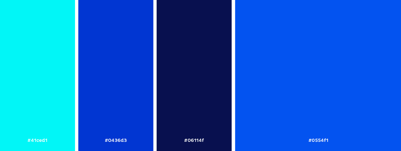
Color palette – A study called “Impact of Color on Marketing” indicates that 93% of people evaluate the colors of a product at the time of purchase, and 84% of consumers believe that the color of a product is much more important than other factors.
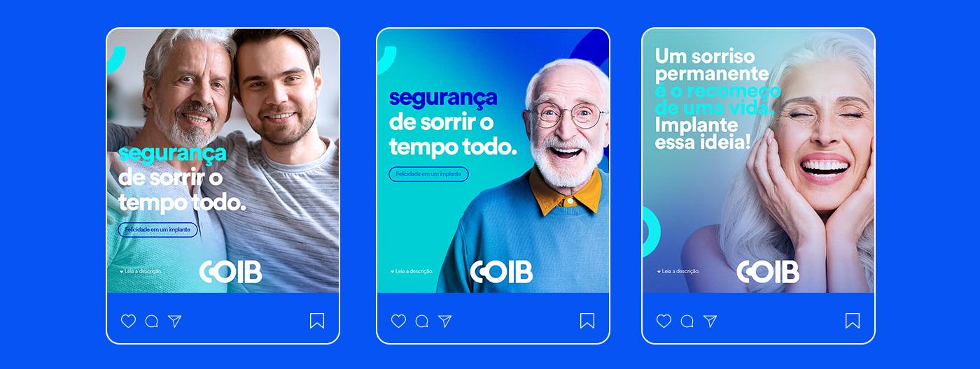
We have utilized a color palette that is not significantly different from the original, but it stands out from the competition in the market. The light blue evokes a sense of cleanliness and freshness, while also stimulating productivity and conveying a feeling of success. On the other hand, dark blue exudes a corporate vibe, showcasing power and confidence. It's a spirited color that provides calmness and reassurance to people.
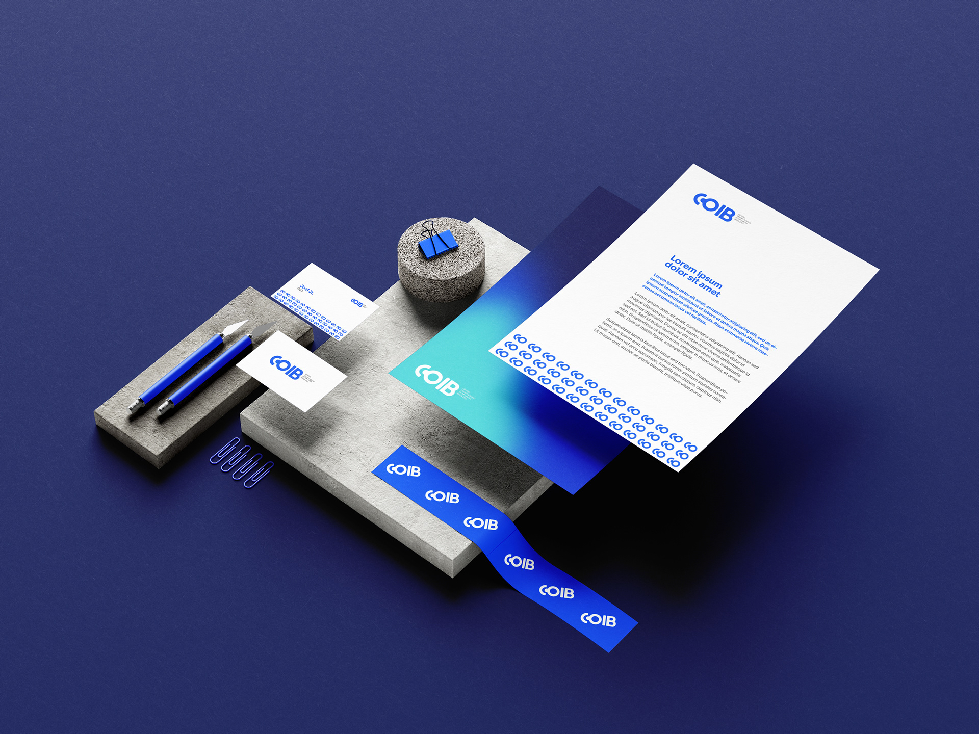
Texture – Visual identity is composed of a set of elements that communicate and represent a company's or brand's vision and positioning. Through the combination of these elements, consumers can recognize the brand and its universe.
Texture refers to the feeling of sensation, touch, and update. The texture is a distinctive component of graphic design that enhances the brand with the presence of visual elements such as patterns, colors, and shapes. Therefore, we have developed an exclusive texture that will serve as a pattern guide for both online and offline advertising materials.

Pattern – Patterns play a significant role in brand recognition. Our brains are inclined to identify and recognize patterns more swiftly. We rely on repetition as a way to remember things, which is why patterns hold such importance in branding. They make brands memorable and form the foundation of visual identity.

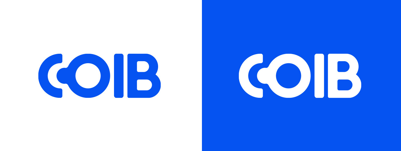
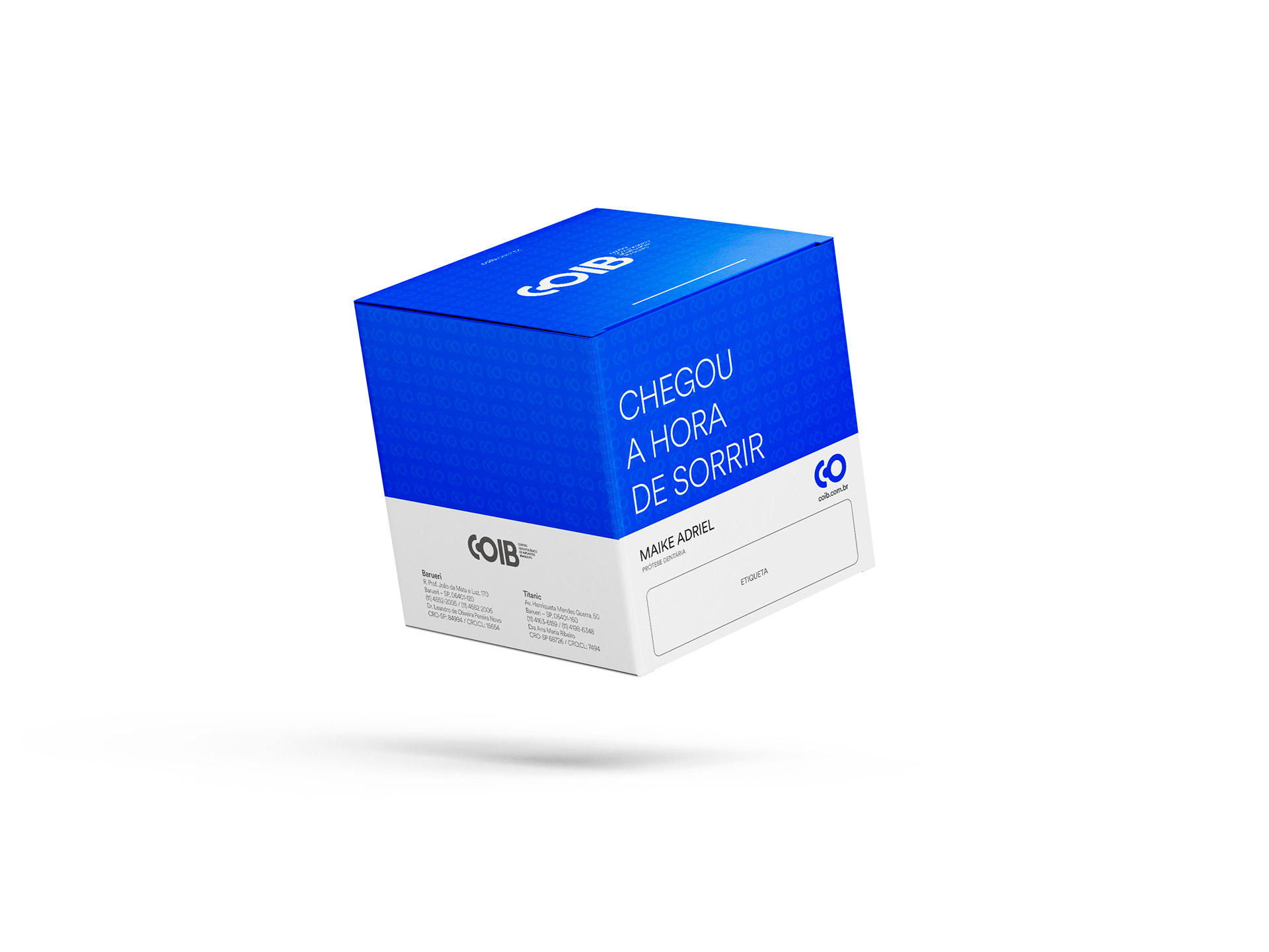
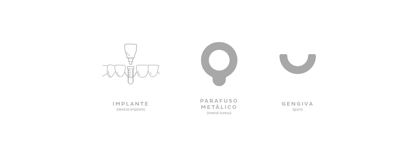
Solution – As a solution, the COIB brand is modern and exudes confidence and security. To achieve this, we incorporated a metallic screw into the identity. Simultaneously, we sought to break away from the typical visual clichés seen in the dental industry, highlighting the COIB's primary product: dental implants. The implant pin, together with the typography shaped as “C” and “O” represents the initials of the name. This signature design gives COIB a distinctive typographic style that adds personality to the brand, making it memorable and positioning it as a leader in the market. With this rebranding, the brand carries with it years of dedication and experience to meet the demands of an increasingly demanding and digital world.